
Build streamline and evolve together with solution
BHT – Baku Holiday Travel is a modern travel platform focused on making travel planning easier, smarter and more accessible for today’s users. Headquartered in Azerbaijan, the company operates with a vision that goes beyond the local market, aiming to serve both regional and international travelers through a digital-first ecosystem.
BHT offers a wide range of services including flights, hotels, multi-city travel planning, tours, travel experiences and customer support — all brought together in one seamless platform. By combining convenience with technology, the brand helps users save time, compare options efficiently and build better travel experiences with less friction.
Unlike traditional travel agencies, BHT positions itself as a scalable travel product built for the future. Its ambition is to create a trusted, recognizable and innovative brand that connects local expertise with global opportunities.
As the business continues to grow, BHT represents a new generation of travel companies: agile, customer-centered and ready to compete in an increasingly digital global market.
A successful rebrand starts long before the first visual is designed. For BHT – Baku Holiday Travel, the strategic phase focused on building a clear foundation that could guide every creative decision and support long-term business growth.
Rather than approaching the project as a surface-level redesign, we treated it as a business transformation. The objective was to define how BHT should be perceived, who it should speak to, and how it could create a stronger position in both the Azerbaijani and global market.
Collaborative Strategic Development
The strategy was developed through a joint working process between the client team, Okee Agency, and 25BUREAU. This collaborative model allowed business goals, market realities and creative opportunities to be aligned from the beginning.
Through workshops, discussions and internal discovery sessions, we mapped the company’s ambitions, service structure, growth priorities and competitive opportunities. This ensured that the final identity would not only look distinctive, but also solve real commercial needs.
Audience Definition & Behavioral Insight
A key part of the process was identifying and structuring the target audience. We analyzed different traveler segments based on motivation, booking behavior, expectations and decision-making patterns.
The strategy considered multiple audience groups, including:
- Local travelers seeking trusted and convenient booking solutions
- Young digital-first users expecting speed and simplicity
- Experience-driven travelers interested in multi-city exploration
- Value-conscious users comparing options efficiently
- International audiences looking for accessible regional travel services
This audience framework helped shape both communication tone and user experience priorities.
Strategic Opportunity
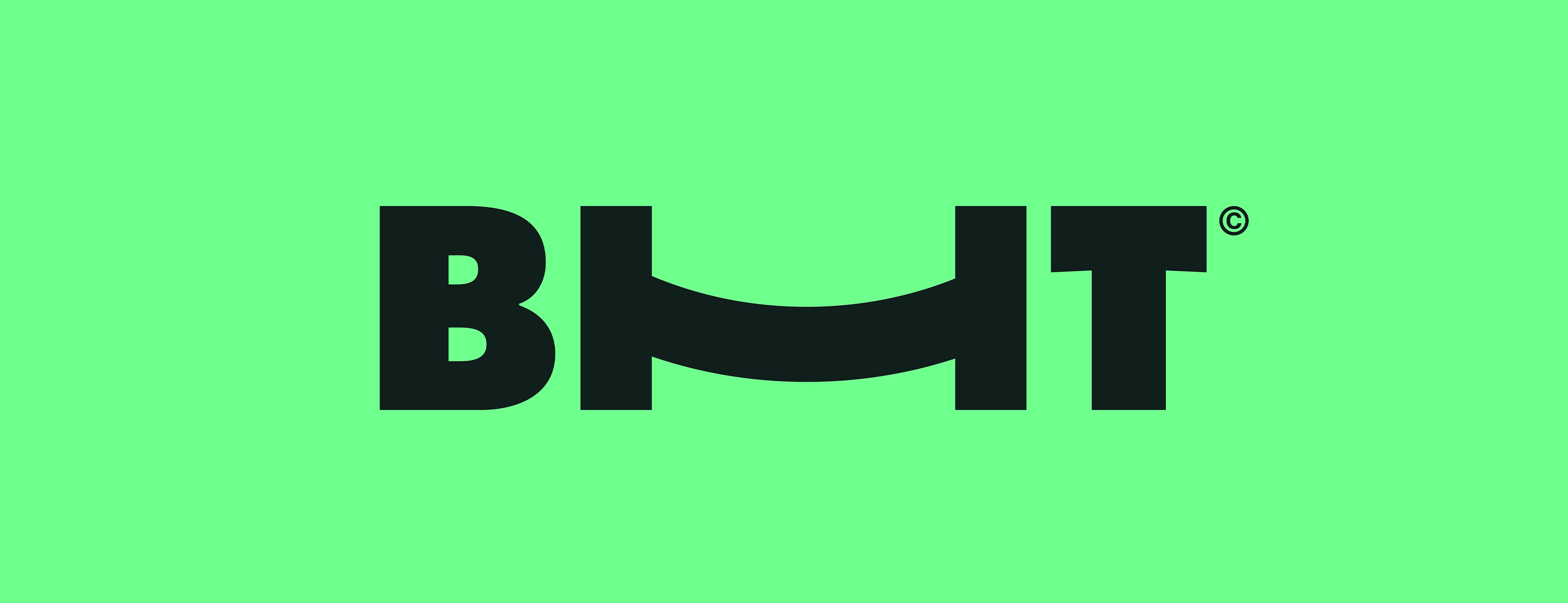
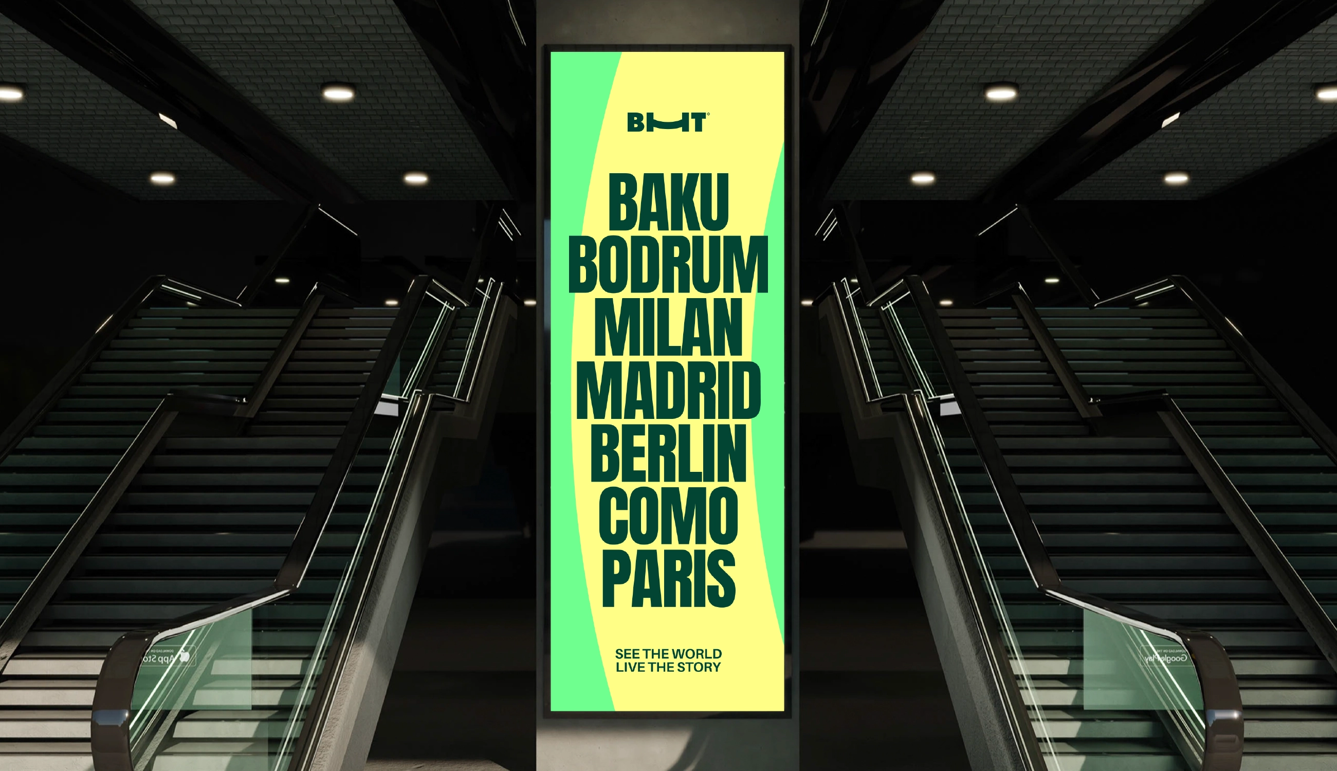
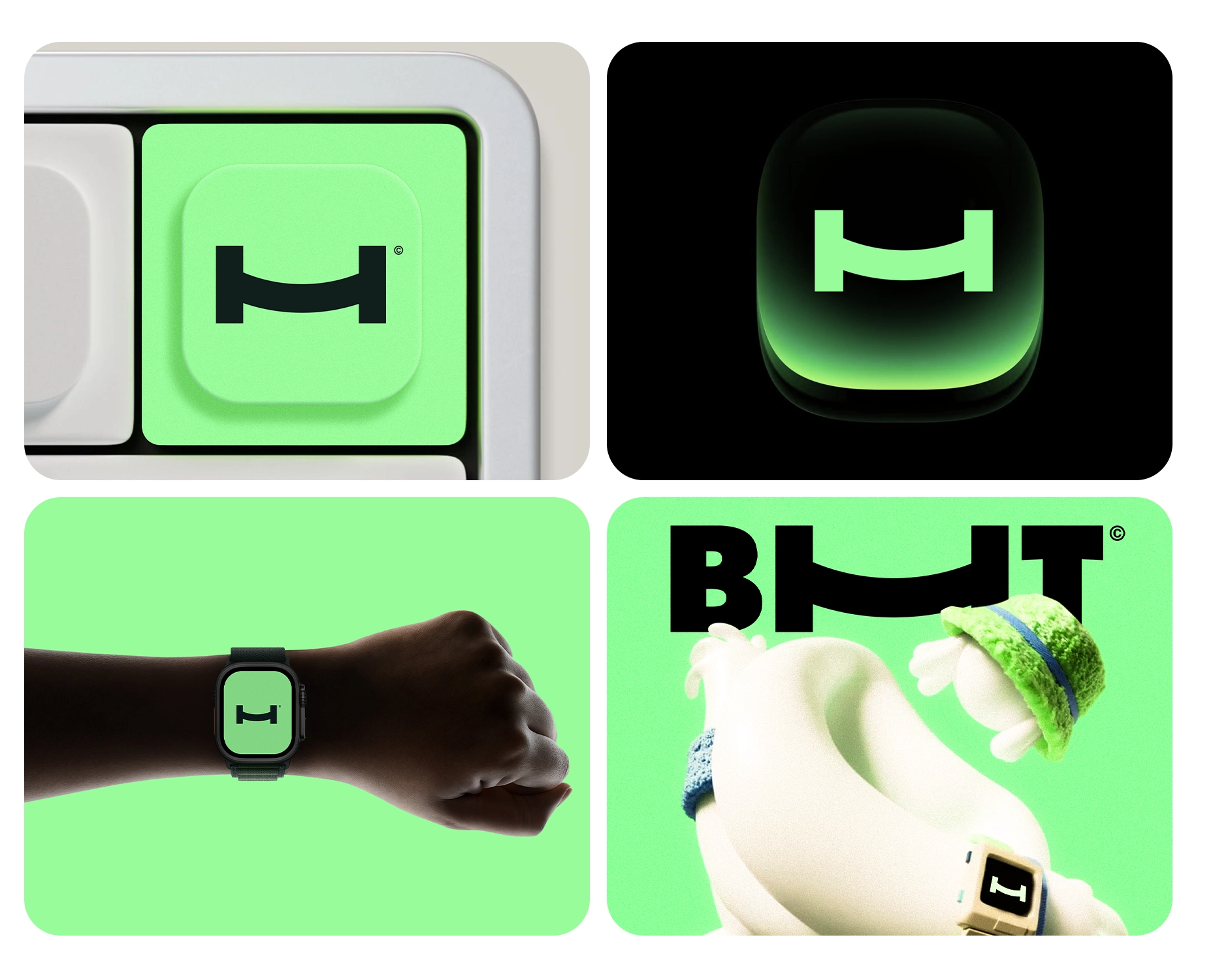
Based on these strategic foundations, we developed a new brand platform for BHT centered around simplicity, movement and emotional connection. The identity was built around a custom H symbol — the most distinctive letter within the brand name and a direct reference to Holiday. Rather than treating it as a decorative element, we transformed it into a meaningful brand asset.
The symbol was intentionally designed to carry multiple associations:
- Smile — representing joy, excitement and positive travel experiences
- Bridge — symbolizing connection between cities, countries and people
- Bed — reflecting comfort, hospitality and rest
This multi-layered approach allowed one simple shape to communicate both emotional and functional value. It became the heart of the brand and the foundation for all future applications.
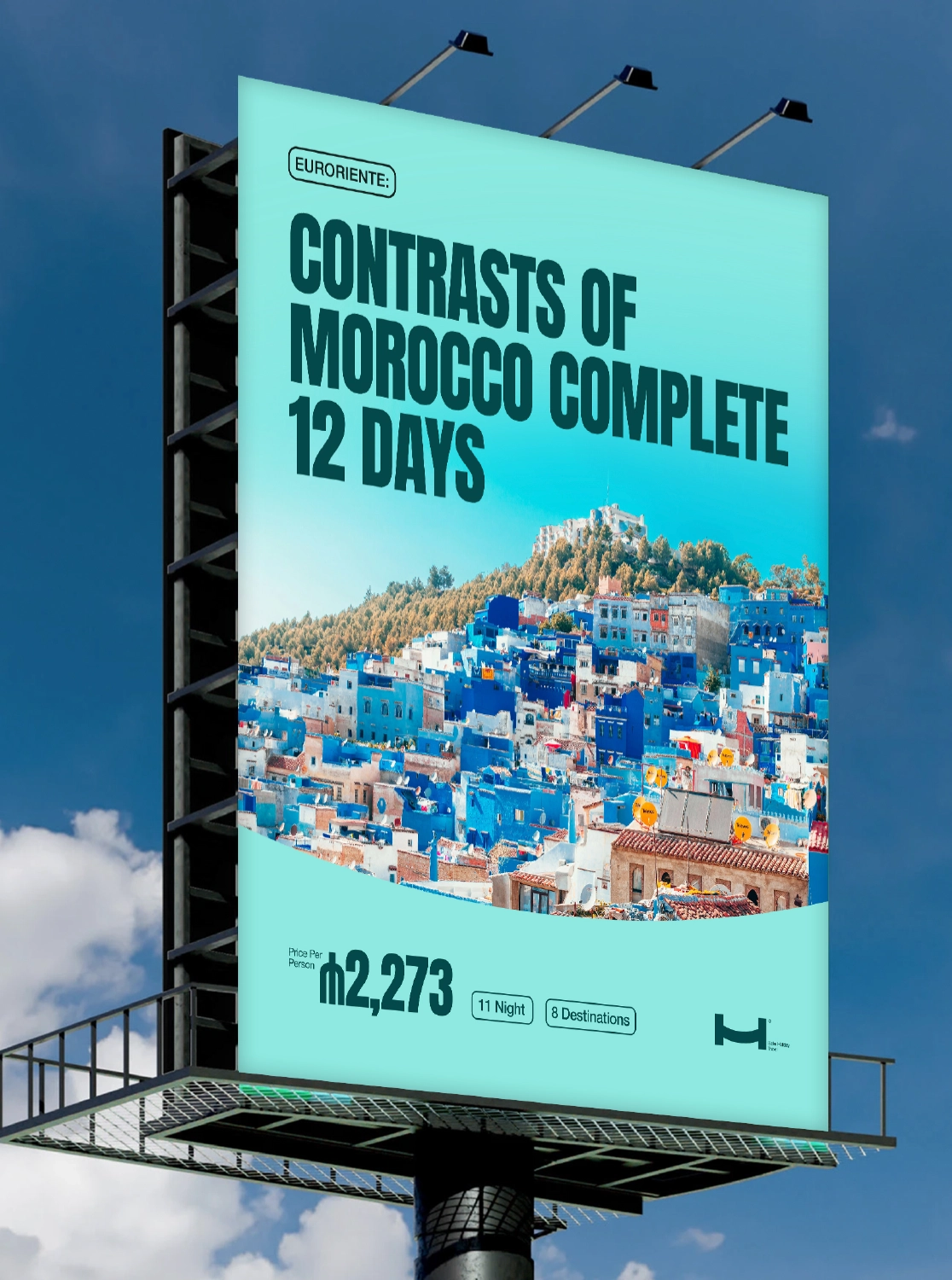
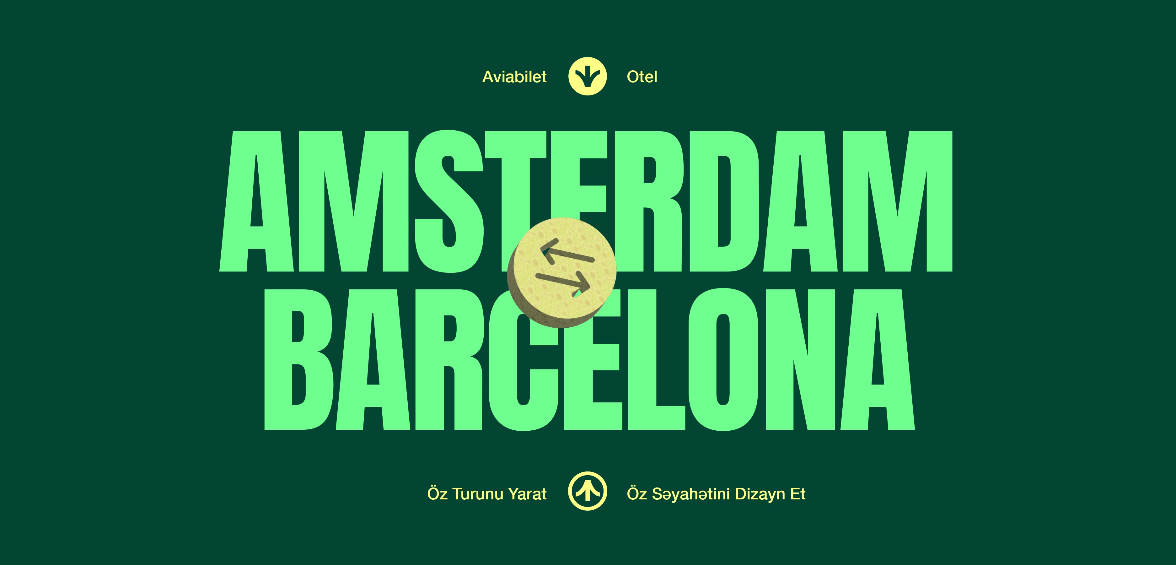
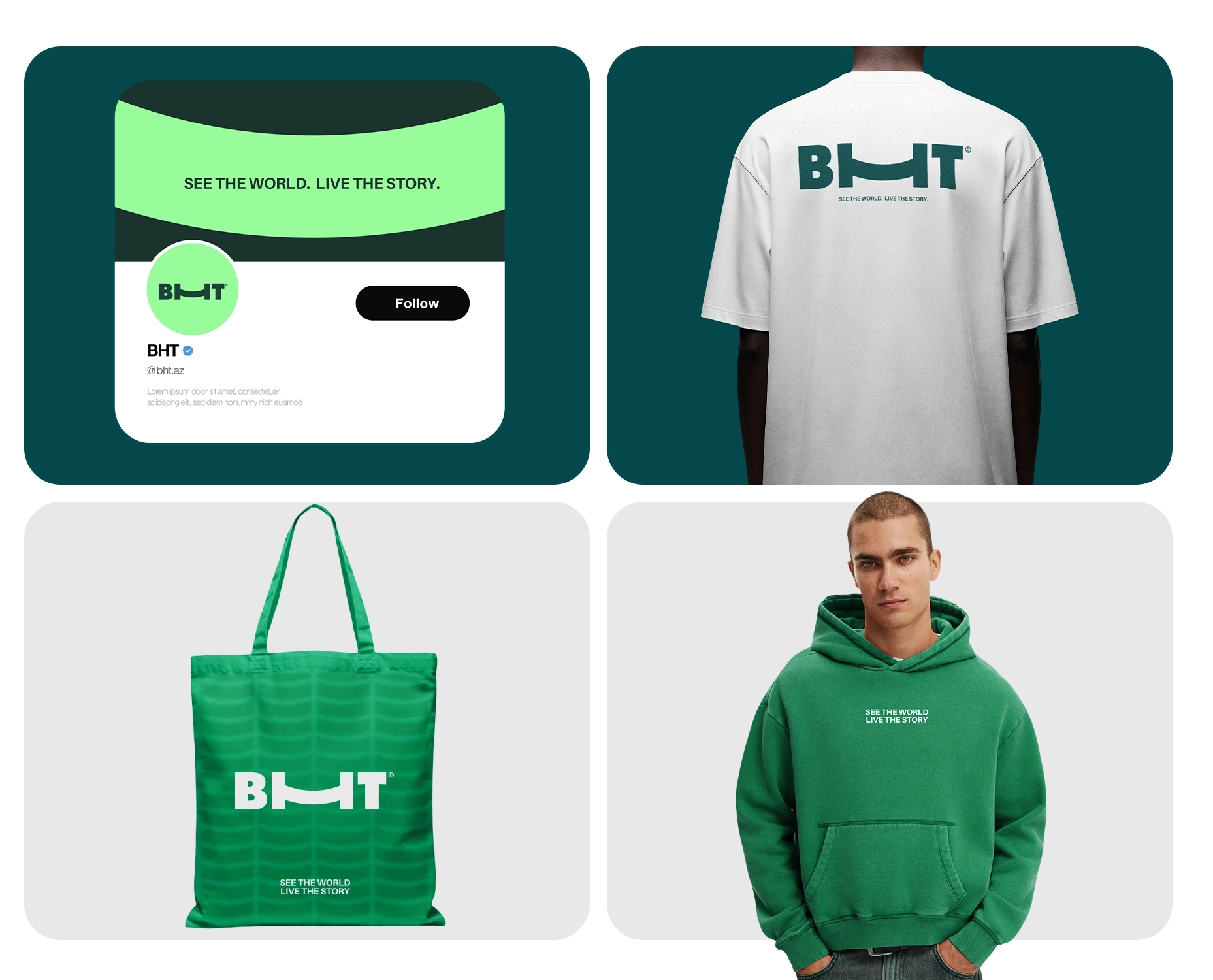
We then expanded the system into a complete visual world. A bold and highly recognizable color palette was introduced to break away from overused category aesthetics. Strong typography was selected to create confidence, clarity and instant recall. Supporting graphic elements, icon systems, layouts and brand rules were designed to ensure consistency across every touchpoint.
The new identity was applied across digital and physical environments, including website visuals, social media systems, campaign creatives, motion assets, promotional materials and outdoor media. Every execution was designed to feel connected, modern and scalable.
The result was more than a rebrand. It was a business tool — a complete brand ecosystem that helps BHT communicate more clearly, appear more premium, grow more confidently and compete more effectively in both local and global markets.
BHT now stands as a future-ready travel brand built on strategy, distinction and long-term adaptability.
+ Brand Identity Development
+ Logo Design System
+ Brand & Communication Strategy
+ Creative Direction
+ Content Creation
+ Social Media Design
+ Web Materials & Digital Assets
+ Visual Language System
+ Typography & Color System
+ Brand Guidelines
+ Campaign Creatives
+ Cross-Platform Brand Applications
